The Body Swap story
2 Likes
Ooh, Head Doctor! I know it’s their own canon, but that’s a deep cut!
I love that everything in this story hinges on ‘radio waves’ and they trap a villain’s mind in a radio. This is so goofy, I’m just so impressed by their ability to transgress the timelines like this.  This was a very satisfying Wrtiers’ Room.
I like a body-swap story where the villain is all, “Exchanging my mind for the hero’s so I can use their powers in my latest scheme is so much easier than trying to trick them into helping me!” and then when they’re ready to swap back, the hero’s like, no, are you kidding, you live in this opulent mansion, you’re good-looking, I don’t have people clamoring for me to save them, you go be the hero, I’m gonna enjoy this!
Funny how that BPW letter got them into a real “who would win?” discussion.
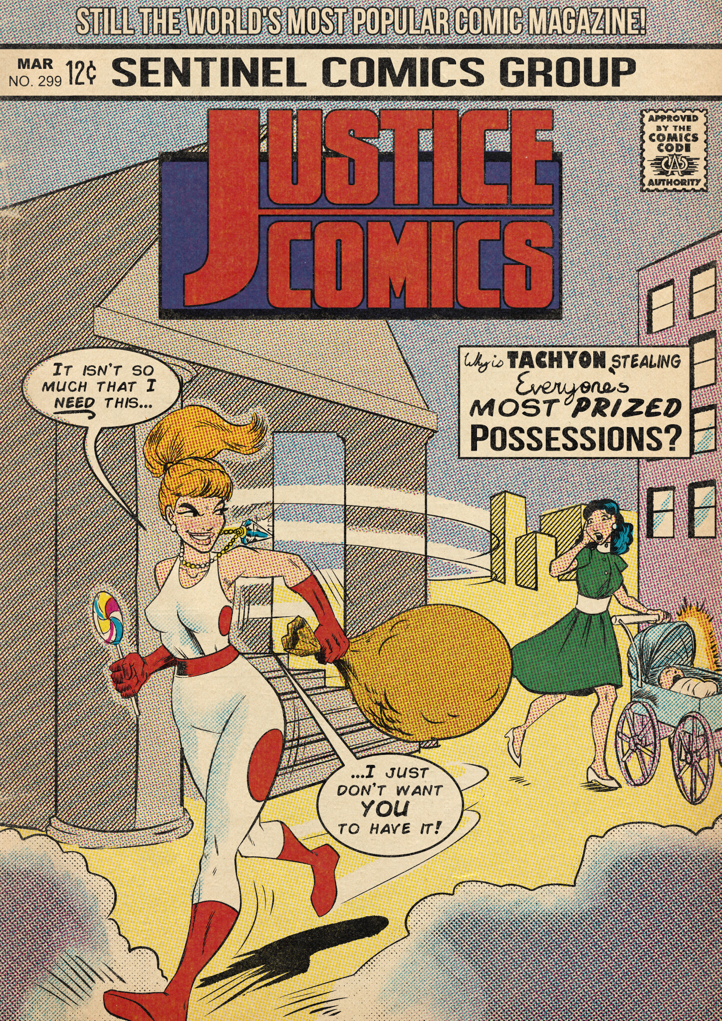
And that cover is just the icing on the cheesy silver age cake.
1 Like
Man, that’s an awful Tachyon costume. On-brand for the silver age, but not far behind the Polka-Dot Man for how terrible it looks.
It’s not much different than her current outfit.
1 Like
Not much, but at the same time so very critically much indeed. Normally she’s almost pure white, with just a couple thin lines and circles of red, which create a visible solid-red blur behind her, but not so much on her. The big clown-nose red spots on the cover are so much more garish, it’s extremely obvious to me (plus the extra red on the boots and things). Obviously in the 60s she couldn’t have the bare shoulder, but otherwise I think the costume would have been better off staying very close to its modern look.
It’s fine to me especially for the era it’s meant to represent. Hero costumes change over time and it’s easy to see if these were real comics how this outfit lines up with her current one. It feels like making a mountain out of a molehill with the criticism.
It’s a mountain-sized eyesore from where I’m looking at it. If it looks like a molehill to you, then your aesthetics are different than mine, which is fine of course; we all have different opinions, and my opinion is that this otherwise-very-fitting Silver Age-style cover features a costume design for Tachyon that I really, really hate. It’s as far away from representing “my” Tachyon as the Adam West TV show costume is from representing “my” {CENSORED}.
I admit I’m with Sonvar on this one: It’s the same outfit except with solid dots and both shoulder straps.
And tall red boots instead of mostly-white tennis shoes.
Yes. I double-checked my memory, and the type of running shoes Tachyon usually wears didn’t exist/start being popular enough to show up in entertainment until the 1960s. Before that athletic shoes were more plain-looking canvas shoes. So she gets the Standard Comic Book Boot that many other Sentinels characters have.
(Although my memory was a bit off, I thought it was the 1970s, it was actually earlier. But still later than would have shown up on this cover.)
If you really want a drastic costume change, might I present something like old skool Argent Adept.
4 Likes
Aha, the mystery is solved:
(PS no I’m not a spambot)